
Pattern is Maple Fall Fingerless Gloves
For the visually-inclined, charts can transform the knitting experience and open up new worlds of non-native-tongue pattern collections. As a designer, I find it a particular boon to be fluent in both written and charted instructions as one set often complements (or calls out issues) in the other.
I am a bit unusual in that charts are my first "knitting language." I started out knitting from stranded colourwork charts, and then at a used book sale in Melbourne many years ago, I picked up this book, which continues to be one of my favourite jumping off points when I'm playing with stitch patterns:

The stitch patterns in this volume are only charted, but since I already had colourwork under my belt, I was already familiar with the "one square = one stitch" concept.

I did, however, spend a lot of time poring over the stitch key. Unfortunately, unlike crochet charts, knitting chart symbols are not universal. There are some common stitch symbols that you will see in familiar shapes across different chart sources, but there are variations. Therefore you always need to start with the key or legend, so that you are sure you know what you're reading. You'll notice that the key above includes instructions for both the Right (RS) and Wrong (WS) sides of the work (this key is automatically generated by my charting software, and doesn't represent what I use in my patterns, to wit the WS instructions for SSK and K2tog are not correct).

To start out slow, I thought about what would be the very simplest chart to read (though it's not necessarily the easiest chart to knit), and decided on the above. It represents 15 rounds of 10 sts of Stockinette stitch, knit in the round. So essentially a large knit tube. The chart is read from right to left, in the direction of the knitting, and after the 10th stitch of each round, you simply start back at the beginning of the next round.
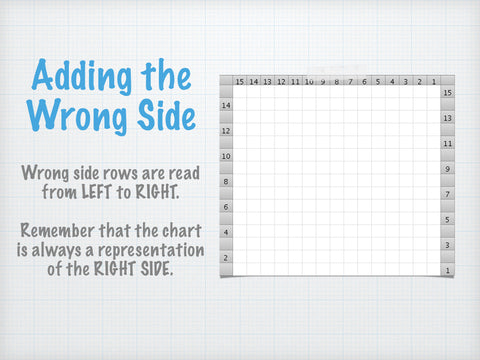
The wrong side (WS) rows are where many people get confused, and it does require a perspective shift. The chart always repesents the RIGHT SIDE of the work, so it can be a bit of a mental cartwheel when you flip your work to do the WS, and the chart doesn't come along for the ride. Instead that flip must be performed in your head. WS rows are read from left to right, and stitch you make must be the opposite of whatever the chart shows - i.e., You are working so that whatever shows up at the BACK of what you're looking at matches the chart. So, for example, above on row 2 (WS) although all the stitches are still empty K squares, when you are working that WS row, you'll be purling, so that on the RS you'll have knit stitches showing up.

When you introduce patterning, such as the [K2, P2] rib shown above, you can begin to see how charting can be an excellent visual representation of the work. Of course, no one would ever publish a chart like the one above - it has too many repeats and could be expressed much more simply. In charts, just as in written instructions, knitters are fond of abbreviation. So rather than the long-form chart above, the actual chart might look something like this:

All the extraneous repeats have been removed, and repeat lines have been added to show where the knitter should begin again. In a stitch collection, this stitch pattern might be noted as being a "multiple of 4, plus 2" which means that this pattern can be worked over any number of stitches that is divisible by 4, with an additional 2 stitches added to balance it out (stitches 5 & 6). In written pattern instructions, an indication would be given as to how many times the pattern was to be repeated, both stitch-wise and length- or row-wise.

Pattern is North American Muscle
My love of colourwork runs deep, and it is one place where you really can't do without the chart. Happily colourwork like this is usually done in the round, so not only is the payoff from chart reading amazing, it's a great way to ease into the whole world of charted patterns. Some things to note are that some colourwork charts use symbols to represent the colours - you'll see this in print publications foremost, where colour printing comes at a premium. Also it's important to note that when you're finding your place again after having put your knitting down for a period of time (that's a thing that normal people do, right?) that you should be guided by the stitches that are actually on your needles, rather than the row below.

In cable charts, the stitch key is once again king. Here the symbols get more involved and can be difficult to parse for the beginning knitter. The biggest hurdle I've run into teaching this type of chart to others is keeping in mind that cable "stitches" often involve more than one individual stitch:

If I enlarge this cable chart, you can see that symbols like the one outlined in green actually encompass FOUR squares. Because one square always equals one stitch, the number of stitches involved in this symbol is 4. From the arrows on the symbol you can surmise that the two stitches on the left are meant to travel over the two stitches on the right, making this a symbol for a 4-stitch right-leaning cable: sl 2 sts to a cable needle (or if you're me, and you're lazy, grab them off the needle with your fingers), hold them in back, knit 2 stitches, then knit the 2 sts from the cable needle (or put them back on the left-hand needle and knit them).

Chart from the Aerie Shawlette
Lace charts can either be extremely straightforward to chart (as above) or extremely difficult. When they are balanced, and the YOs in each row equal the decreases, the stitch count remains the same and they don't have to end up looking like this:

Now I realize that this is a chart that has the potential to send charting newbies screaming for the hills, and I agree that it is not a thing of beauty and requires a certain amount of faith to begin, but bear with me; because all those blank dark grey spaces aren't as scary as they look. I'll come back to them. First a last word on lace chart variations:

Chart from Boon of Roses Scarf (where it appears with WS rows intact)
Because most lace patterns have identical WS rows (sometimes referred to as resting rows), which are usually entirely purled, some designers prefer to remove the WS rows from lace charts entirely. The argument is that the foreshortened chart is a closer visual representation of the actual resulting lace. As a graphic designer however, I appreciate the presence of a little breathing room in my visuals, and I find this type of chart cramped and disorienting, so I don't omit the WS rows.

Chart excerpt from Eramosa Vest
Now back to those blacked out stitches. When a stitch count alters, the blacked out (or in other charts, simply disappearing) stitches represent that change. It means, literally, that there is no longer a stitch there. But while it leaves a gap in your chart, you do not need to replicate this gap in your knitting. In fact, please, please don't. The way to treat these ghosted stitches is to simply pretend they don't exist (because... they don't) and skip over them to the next real stitch.

Finally, for those who want to take their charting adventure to the next level and start creating their own, some suggestions. Obviously the easiest place to start is with graph paper. I have heard some designers praising Rhodia graph paper for having lines that showed up well with scans or photocopying:

If you're not yet ready to dive into the world of dedicated software, there are some good tutorials online for using Excel to chart, including this one from local designer AnnieBee.
I use Intwined Pattern Studio to chart. It has certain limitations, which I overcome with Illustrator, but I know not everyone is lucky enough to have that option. I like it because it's inexpensive, it was simple to learn, and over the years I've installed it on successive machines without issues (and without paying for it again). In two words, it is robust and uncomplicated.
I know many other designers use Stitchmastery very happily, and its charts are certainly more attractive than the ones I'm able to generate. Sadly Stitchmastery hasn't kept up with the Mac operating system, so unless you're willing to install several work arounds to get it to run, you're (I'm) out of luck on that platform.
Happy charting everyone, and if you have anything to add, please do so below!