In Part 1 I gave a brief overview and resources dealing with colour theory and how to use it effectively in your yarn craft.
When I think about colour, however, the theory of the choices we make only accounts for half of the colour equation. I believe that, in order to get a fuller picture of colour and how it motivates us, we should also consider how we perceive colour, physically, as well as emotionally and culturally. Regardless of what the theory tells us is "right" in terms of schemes and contrast balance, colour choice is ultimately subject to an individual's preferences, and that can have a myriad of influences, beginning with how colour is physically processed by our eyes. BuzzFeed: 11 Impossibly Cool Facts You May Not Know About Your Eyes
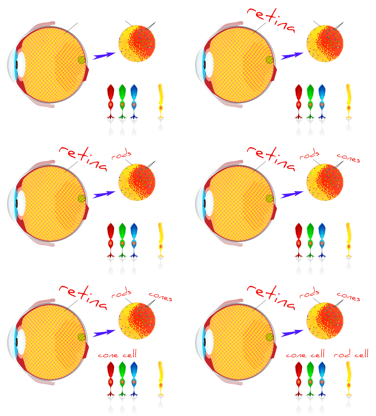
Human eyes contain three types of cone photoreceptors located centrally on the retina in an area called the fovea. Each cone type is sensitive to different wavelengths of light (i.e. different colours). The cone cells transduce the light information from our environment into electrical signals which are transmitted to the visual cortex via the optic nerve. Colour blindness occurs when certain types of cone cells are inactive or missing in the eye. Interestingly, the spread of cone cells in the eye is not even amongst the different types. The vast majority - 64% - of cones respond most strongly to red light, 33% to green, and 3% to blue. Also interesting is that this sensitivity corresponds to the order in which most languages have developed words to describe different colours, with red coming first, green following, and blue usually coming last.
Radiolab has a fascinating podcast about colour perception that deals further with cone cells in humans (could you be a tetrachromat?), as well as other species; the development of colour perception in ancient cultures; and why the colour blue is so elusive. (However, be forearmed with a grain of salt: the study they referenced about the Himba tribe of Namibia turns out to be something made up for a BBC documentary.)
So that's how we see colour physically, but it doesn't account for how we react to colour personally. Why do some colours jump out at us more readily than others? How do we arrive at a "favourite" colour, and further, can we direct our colour preferences if we understand them better?
Some other factors to consider:
- Culture & society - different cultures attach different significance to colours. Think about pink and blue when a baby is expected. Does a bride wear white, or does she wear red? What does that flashing yellow light mean?
- Environment - what colours do you see around you most often? In different climates, different colours will be predominant in nature. Blue happens extremely rarely in nature (with the exception of the sky). In cities, what colours are at play in the buildings, the signs and billboards, the vehicles and roadways?
- Occupation - people engaged in creative occupations are more likely to be in tune with their colour "sense" than others. Think artists and designers: those for whom colour choice and awareness is a daily consideration.
- Experience - our life experience also informs our colour preferences. Anecdotally, as a child a friend told me that pink was too girly, and as a result I refused to wear it in any form until I was in my 20s. When I finally made peace with the colour, I had so much catching up to do that I wore pink for my own wedding.
- Emotion - certain colours evoke certain emotions, and this effect can be harnessed. Read more about the psychological effects of colour.
Now that we have a fuller picture of both sides of the colour experience, here are some ideas for expanding your colour language. Try one or two, and observe how you respond to the visual:
- Combine your favourite colour with its complementary from the colour wheel
- Look through your yarn stash and find the missing colour, then go after it (an excellent yarn acquisition excuse)
- Plan your next project in colours that oppose those you are currently using
- Alter the shade or tint of the colour you gravitate towards most
- Keep a colour journal of items that inspire you & use them to identify and create colour schemes (i.e. project mood boards - for great examples of mood boards see the Twist Collective)
- Check your colour scheme for contrast by creating a grayscale photo
- If a colour scheme seems too intense, add a neutral to balance
Happy exploring!
