Colour choice is incredibly important to every fibre crafter I know. When you are working from a pattern, for example, your colour choice is the central most important element of your interpretation of the work. Will you replicate the scheme exactly? Or choose your own colour adventure?
As yarn-users, unless we are lucky enough to have the skills to dye our own, or know someone who can, we are limited to the palette set out by yarn manufacturers. It's a different reality from that enjoyed by painters, and other artists with the freedom to create their own unique colours by mixing.
That said, colour theory still has a place in what we do. Even though our colours are pre-determined, how we combine them is still something that we can practice - because like anything else it does get easier the more you work at it.
This month, I've delved into colour theory on one hand, and the perception of colour on the other hand (covered in Part 2), in the hopes of inspiring you to deepen your understanding of colour and its use.
Colour theory always begins here, with the colour wheel:

The basic colour wheel combines Primary, Secondary, and Tertiary colours. Primary colours = Red, Blue, Yellow. Secondary colours are the combinations of Primaries = Violet, Green, Orange. Tertiary colours are the combinations of Primaries and Secondaries where they meet on the wheel = Yellow-Green, Blue-Green, Blue-Violet, Red-Violet, Red-Orange, Yellow-Orange.
For more in-depth colour wheel info, as well as great examples of colour theory expressed in yarn, see Lacie Lynnae's The Ultimate Guide to Colour Theory for Sweater Knitters Part 1: The Colour Wheel.
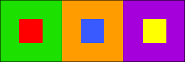
The colour wheel is the basis for all colour possibilities, and combinations. By varying, the tint (amount of white in a colour) or shade (amount of black) and the proportions of different hues (eg. red and blue) contained in a colour, you can arrive at any colour imaginable. By understanding how colours interact with each other on the wheel, how they relate in terms of contrast and similarity (i.e. how much they overlap in hue content - for example, red and purple both contain red, and so are related), you can create striking and well-balanced colour schemes.
Knowing some standard colour schemes will set you up with the tools for manipulating them successfully.
Monochromatic:
- tints and shades of the same hue
- simple and easy to create.
Analogous:
- colours adjacent to each other on the colour wheel.
- sharing a common component ensures harmony.
Complementary:
- using hues that are directly opposite across colour wheel
- high contrast
- each makes the other hue look more intense
- balance the scheme by using different values (tints and shades) to offset high contrast
Split Complementary:
- colour + the colours adjacent to its complement
- maintains intense contrast
- balance with combination of shades & tints


Triadic:
- uses any three hues equidistant from each other on the colour wheel
- quite vibrant
- balance contrast for success
There are even further colour scheme formulas that you can use to ensure that your colour choices are cooperating, but these are a great start. If you're struggling with a colour combinations, it helps to fall back on techniques that are proven to work. If you're still having trouble within a prescribed scheme, remember to try varying the value (shade) or saturation (tint) of the colours you've chosen, to either add or reduce contrast within the scheme. This can help to calm very loud schemes, or increase the visual interest in schemes where the colours have values that are too similar for good contrast.
Further reading:
- Ann Weaver has a great guest series about colour for knitters at Mason-Dixon Knitting (here are parts TWO and THREE as they aren't easy to find in MDK's nav)
- Craftsy Blog: Exploring Colour for your Knitting
- Knitty.com: Colour Theory for Knitters